Silva & Ribeirinho
Graphic Design
The Company
The Company is a bread bakery that had changed management and wanted to refresh its image with a homemade approach that felt like family to represent the new owner’s vision.
In this particular project, the company name had the previous management’s personal name. Still, the client decided to keep it as it didn’t want to affect the regular client’s perception of the business by maintaining the feeling of belonging to the community.
The Process
Scoping
Scoping the business image was not hard as I was well acquainted with them before this commission. This proved to be essential for an efficient design
New Ideas
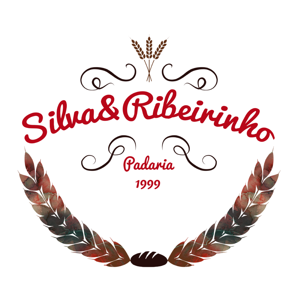
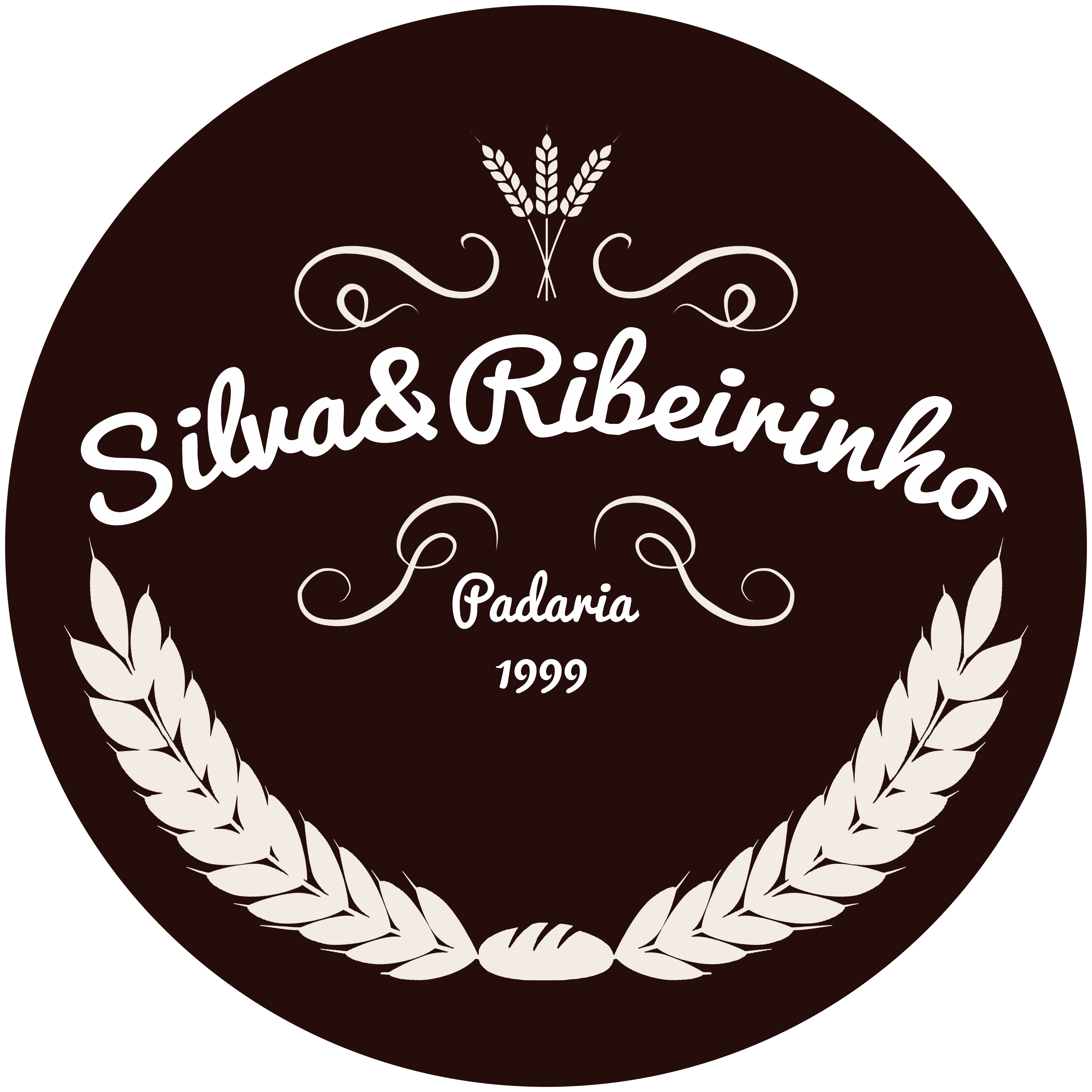
My main idea was to give it a modern twist to a vintage base. I decided on warmer colour as it is a food sector, with red being the main to call attention, with a contrasting accent colour to give some balance.
Timeline
The deadline of this project was set for one month, but we managed to complete after two weeks.
Clear Vision
Reaching a final product with the client proved quite easy as they automatically fell in love with my initial idea of their business image. This project showed me that having a good grasp of the Clients image and vision is essential for a good design.
Wrapping up
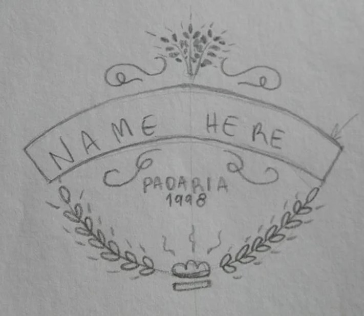
Once the customer approved the main logo, all the final versions were shared, with different colour schemes for many different needs.
